

Bee Welsh Honey
WORK / Branding
Mid Wales Branding for Bee Welsh Honey.
Bee Welsh Honey is an award-winning producer of premium Welsh honey based in the heart of Mid Wales. Passionate about quality and sustainability, the business has built a strong reputation for producing exceptional honey while celebrating the natural landscapes and biodiversity of the region.
Looking to strengthen their brand and stand out in a competitive marketplace, Bee Welsh Honey partnered with us to develop a distinctive visual identity that reflected their values, products, and heritage.
Working closely with the team, we took the time to understand their goals, vision, and aspirations for the brand. These insights formed the foundation of a creative branding project that captures the authenticity of Bee Welsh Honey while creating a memorable identity that appeals to both existing and new customers.
- SERVICES
- Branding
- INDUSTRY
- Manufacturing
- LOCATION
- Builth Wells, UK

Developing a premium identity inspired by quality and Welsh heritage
Crafting Memorable Food Branding.
Every food branding project begins with understanding what makes a business unique. Our goal is to create a memorable visual identity that not only stands out on the shelf but also reflects the values, quality, and story behind the brand.
For Bee Welsh Honey, this meant developing a refined brand identity that celebrates both their premium products and their strong Welsh heritage. We created a distinctive new logo, professionally designed product labels, and supporting business stationery, including business cards, to ensure a consistent look across every customer touchpoint.
The result is a cohesive brand that communicates authenticity, craftsmanship, and quality, helping Bee Welsh Honey strengthen its presence and leave a lasting impression on customers.
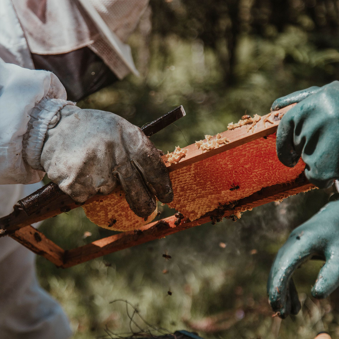
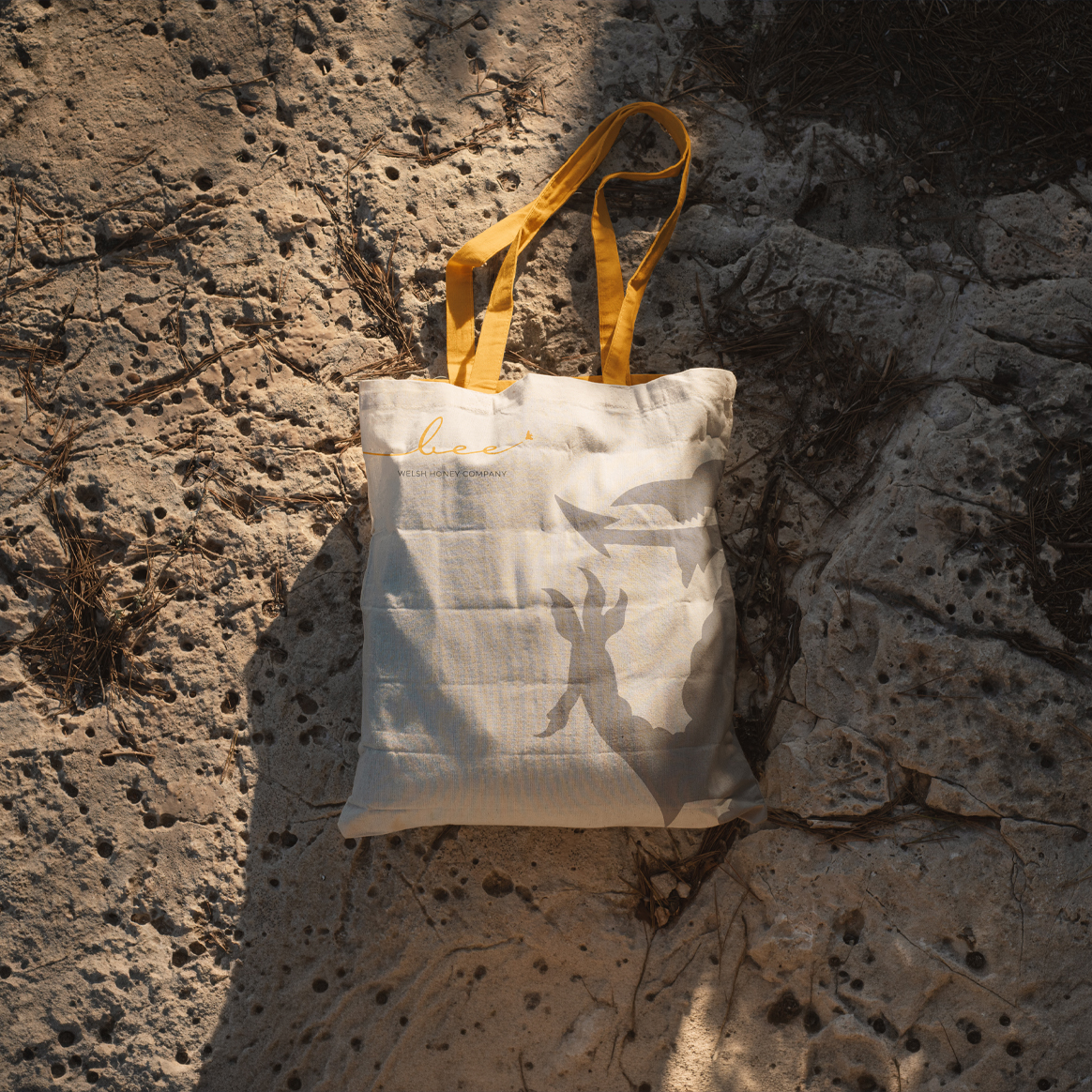
Designing a distinctive identity inspired by the product itself
Elevating Brand Image with Visual Identity.
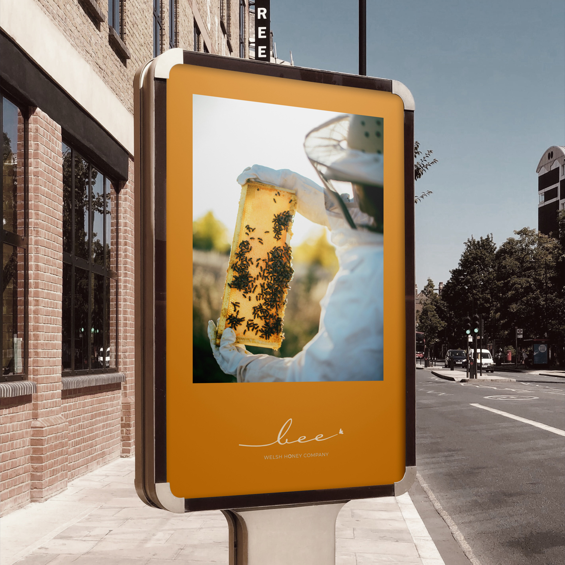
The new visual identity was carefully designed to reflect the premium quality and Welsh heritage of Bee Welsh Honey. We adopted a clean, minimalist approach that creates a modern yet timeless brand, allowing the product to take centre stage.
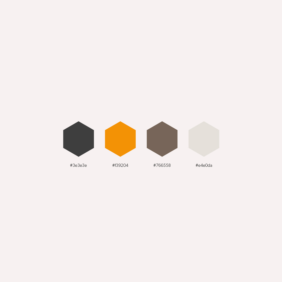
The bespoke logo features an elegant italic typeface, subtly inspired by the flight path of a bee, with a small bee illustration reinforcing the concept. A rich mustard yellow was selected as the primary brand colour to represent the warmth, quality, and natural richness of the honey.
To strengthen brand recognition, we incorporated a honeycomb hexagon into the logo, replacing the letter “O” in Honey. We also included clear supporting text identifying Bee Welsh Honey as a Welsh producer, ensuring customers immediately understand both the product and its origins.
Together, these design elements create a memorable visual identity that reflects the craftsmanship, authenticity, and premium nature of the Bee Welsh Honey brand.
Creating packaging that celebrates quality and provenance
Showcasing Welsh Heritage.
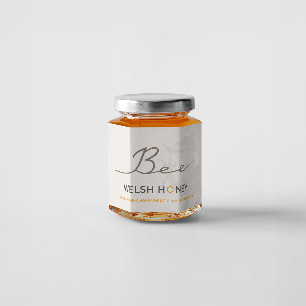
To strengthen Bee Welsh Honey’s visual identity, we designed two bespoke product labels that celebrate both the brand’s Welsh heritage and the premium quality of its honey.
Each label was carefully crafted to complement the new branding while helping the products stand out on the shelf. By combining clean layouts, distinctive design elements, and subtle references to Wales, the packaging reinforces the authenticity of the brand and creates a strong connection with customers.
The result is a cohesive packaging design that reflects Bee Welsh Honey’s commitment to quality, craftsmanship, and locally produced Welsh honey.
OUR SERVICES
Services & Technology
Bee Welsh Honey, an award-winning producer of premium honey based in Mid Wales, partnered with us to create a stronger, more distinctive brand identity that reflected the quality of their products and their Welsh heritage. By working closely with the team, we developed a clear understanding of their vision, values, and long-term ambitions.
Using these insights, our creative team crafted a refreshed visual identity that captures the authenticity of the brand while helping Bee Welsh Honey build a stronger connection with both existing and new customers. The result is a cohesive brand that showcases the business’s commitment to quality, provenance, and exceptional Welsh produce.
Creating a clean and elegant design that reflects premium quality
Minimalist Label Design
For one of Bee Welsh Honey’s product labels, we created a refined design that highlights the premium quality of the brand while maintaining clear readability. The logo uses a bold black finish, allowing the key branding elements to stand out, while rich gold detailing enhances the honeycomb hexagon and bee graphic to reflect the natural luxury of the product.
The clean and uncluttered layout ensures important information is easy to find, including Bee Welsh Honey’s status as an award-winning Welsh producer. This helps build trust with customers while reinforcing the quality and authenticity of the brand.
To further celebrate their Welsh roots, we incorporated a subtle grey Welsh dragon behind the text, adding a distinctive heritage element without overpowering the overall design. The result is a sophisticated label that combines premium styling with a strong sense of place.
Creating a consistent and memorable brand experience.
Professional Business Cards.
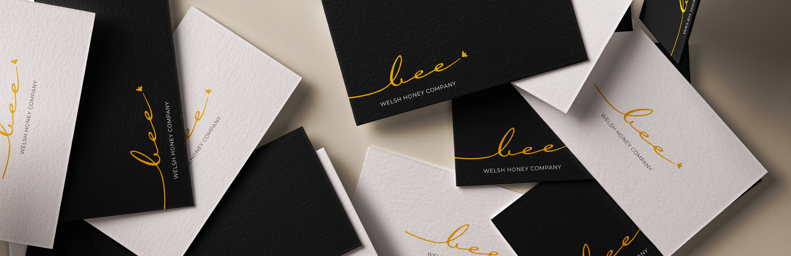
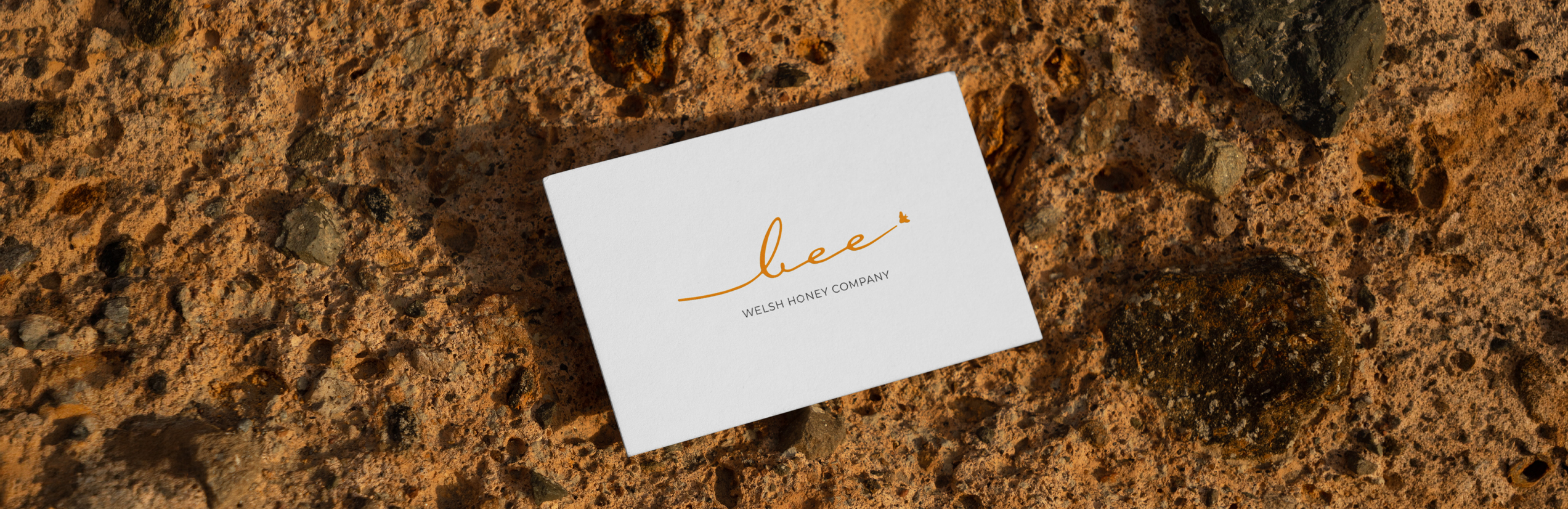
To complement Bee Welsh Honey’s refreshed visual identity, we designed professional business cards that provide a polished and practical way for the team to connect with customers and potential partners.
The cards feature the new branding while maintaining the clean, premium aesthetic developed across the wider identity. With clear contact details and a simple layout, they ensure important information is easy to access while reinforcing the quality and professionalism of the Bee Welsh Honey brand.
These business cards help create a consistent brand experience across every customer touchpoint, from product packaging to in-person interactions.
OUR WORK