

Reflecting Our Evolution and Values
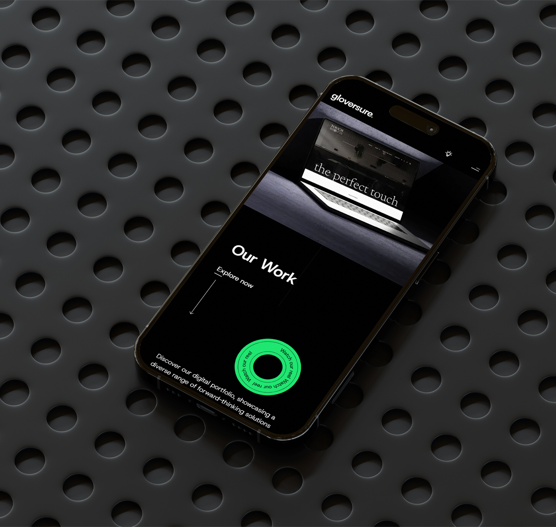
At gloversure, we’re always evolving, and that includes our brand. Recently, we made the decision to update our look, shifting from pink to green. This rebrand is more than just a change of colour – it’s about aligning our visual identity with who we are today and where we’re headed. It’s a reflection of our commitment to being both modern and responsible. Here’s why we’ve rebranded and what it means for us moving forward.

Representing Our Mission and Values
We’ve always been committed to doing things right for our clients and our community. While our old branding worked for us in the past, it no longer reflected the direction we are heading. Our mission to create meaningful and sustainable change isn’t just about energy-efficient practices or carbon negativity (although that’s an important part of it). It’s about staying true to the values that guide us – quality, responsibility, and innovation.
The switch from pink to green represents this shift. Green symbolises growth, renewal, and balance. But it’s also a nod to the world around us – it’s a colour that reflects our focus on the future, a future where we continue to grow while being mindful of the impact we have on the environment.

Bringing Our Brand Up to Date
As we’ve grown and expanded our services, it became clear that our branding needed an update. It’s not just about sustainability; it’s about staying current, fresh, and relevant in a fast-paced digital world. Green has a contemporary, fresh feel that aligns perfectly with the innovation and creativity we bring to the table. Our new look is a reflection of the forward-thinking approach we take in every project we work on.
The rebrand also represents our ongoing efforts to modernise our processes. We’ve spent time upgrading our website, refining our services, and embracing the latest technologies to better serve our clients. The green isn’t just a colour change – it’s a symbol of how we’re keeping pace with the changing digital landscape, all while maintaining the same high standards of service and expertise we’ve always offered.
Aligning Our Operations with Our Values
While we’ve always been committed to sustainability, we wanted our brand to reflect more than just that. Our shift to green also aligns with our internal operations. We’ve made strides to integrate eco-friendly practices, such as adding solar panels for greener energy and choosing green hosting for our website. These decisions represent how we’re aligning our operations with our core values and ensuring our impact on the planet is minimal.
Additionally, we’ve focused on optimising the websites that we develop to ensure they are as efficient as possible. Streamlined, well-coded sites are not only better for performance, but they also help us deliver faster and more sustainable solutions to our clients.

What This Means for Our Clients
For our clients, this rebrand represents a renewed commitment to quality, innovation, and sustainability. You’ll see it in everything we do, from the websites we design and develop to the strategies we implement. The new brand gives us the opportunity to show up in a way that aligns with the values we’ve always held dear, but also showcases how we’ve grown and evolved over time.
By choosing to work with us, you’re partnering with a team that is constantly striving to be better, smarter, and more effective. We’re committed to offering solutions that reflect the latest trends and technologies, while always keeping an eye on our shared responsibility to the planet.

Moving Forward: A Brand for the Future
This rebrand marks the next chapter in our journey – a journey of growth, evolution, and continuous improvement. The new look is just the beginning. As we continue to adapt to new trends, technologies, and sustainability practices, we’ll be sure to carry our core values with us every step of the way.
We’re excited about what the future holds. Our new green branding isn’t just a colour change; it’s a symbol of everything we stand for – innovation, responsibility, and a commitment to staying relevant in an ever-changing digital world. We can’t wait to continue this journey with you.